the first grown-up apartment

This past weekend was a momentous occasion. We were asked to help with the fixing up of the oldest daughter’s first grown-up apartment. The request was simple, “Help me make it look not like a dorm room”.  She asked for advice with picking out paint colors, and then we went one better and went to help her paint. I started by taking some photos of the small apartment and used my Color Capture app to illustrate my ideas.

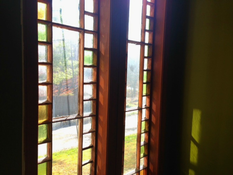
The entryway was the jumping off point to the color scheme because the most striking feature of the apartment is there – beautiful tall windows that are edged with yellow and green stained glass squares. I thought she should put most saturated color there because the apartment has very low ceilings, and though it is sunny in the living room, the windows are rather small. A saturated color in the entryway would be an interesting highlight and would not be oppressive in the small space. A green for the entryway would bring in the outdoor foliage and the colors of the stained glass in the windows.

A stepfather with an eye for detail is a good thing

window

I suggested a un-babyish blue for the living room so that the room would feel expansive and sophisticated. The kitchen counter is yellow and the backsplash is grey tile. The existing color for the cabinets was a yellow that made them the focal point of the room when they shouldn’t have been. I thought a light color would make the cabinets recede and make the kitchen look clean and neat. I sent Camelia some samples I made with the Color Capture app and some paint chips look at in the light of the apartment.

the kitchen before. the yellow cabinets dominate and the beige walls were dull

Using my general direction but making her own choices, Camelia picked beautiful colors. She picked Benjamin Moore’s Silver Cloud for the living room/kitchen. It is a luminescent greyish blue color that changes with the light and made the room look soothing and fresh. In the late afternoon sun, a wall might look white one place, a soft grey or blue in another – an interesting chameleon-like color. The white trim of the windows looked crisp against it even though they had not been repainted.

painting the living room in Silver Cloud

the grown-up with very good taste in paint color choices

work-in-progress, benjamin moore’s bavarian cream on the cabinets

For the entryway, she chose a mossy green, Benjamin Moore’s Dark Celery. The kitchen cabinets were painted in a luscious creamy color. It was beautiful to see the paint brushstrokes of the color that is so aptly named Bavarian Cream.

We painted together and laughed and went out to dinner and watched a late movie and then slept over in our daughter’s first grown-up apartment.

paper lantern pizzazz

Oona made this pendant lamp for my bedroom. It is all the right good things – cheap, beautiful, and easy to do.

Oona created the lamp in a marathon of TV watching of Law & Order or Hell’s Kitchen late into the night. It is a dramatic light fixture for very little money. I saw a tutorial on Design Sponge – click here for her post with more how-to photos.

So simple to make, it requires only a few materials:

– a round paper lamp shade purchased at Ikea
– paper
– wood glue
– a cool to the touch LED lightbulb. I bought a dimmable one.

This light fixture cost under $20 to make.

the twin teardrop chandeliers

The work on the entryway is slow going, but it’s going. Back in the winter, I purchased two teardrop chandeliers from PB Teen that were on sale. When I finally got around to putting the first one up in the spring, we discovered that it was defective. I was so disappointed when I checked the website and saw they were no more. The lamp was tinkered with and deemed okay as long as the bulb wasn’t changed. So I stuck a bulb in there that would last for 30 years and hoped for the best. A week went by and then it died for real. Since so much time had passed, I never thought the store would give me a refund so I settled into the idea that the hallway would only have one light. But I didn’t like it. The lighting placement looked lopsided and there was a very ugly glob of plaster in the ceiling at the other end that I’d made worse by gouging at it with a knife thinking there was a box for a light fixture there.

One day I decided to do a web search for “teardrop chandelier” to see if I could find something similar that would look good with the existing light. And the first thing that popped up was the same chandelier from PB Teen! It was back! I called them and told them the story. To my surprise and delight, they said they would send me a replacement chandelier right away even though it was months since I’d bought it. Old school customer service.

PB Teen Teardrop Chandeliers

The electrician that has installed and fixed all of the light fixtures in the apartment is a woman named Deb Lee. I really like the fact that she is a woman electrician. In my mind there are two jobs that clearly fall under the responsibility of the man of the house:

1. Dealing with all potential electrocution scenarios.
2. The removal of dead vermin.

So I’m in awe of Deb.

Deb Lee at work

When the new chandelier arrived, Deb came to install it along with her colleague Eric. She told me that it would look so much better to run the cabling inside the ceiling instead of just hiding the wires with a wiremold. Eric was there to plaster away the holes. He even covered the glob that was such an eyesore. Good craftspeople who are skilled and care about what they do are hard to find – I am lucky. More to come…

Eric hard at work

woolly pockets for the bathroom wall

I’m putting the finishing touches on the bathroom and I wanted to hang Woolly Pockets for an indoor garden to add drama to the stark white walls. The only visual pop in my bathroom are the Cuban tiles on the floor, the rest is clean white subway tile (see more here). My neighbor Brad gave me the idea. Our bathroom window faces the community garden adjacent to the homestead and the weeping willows can be seen as you are taking a shower. Brad said he wanted plants in his bathroom in order to extend the green into the room. I liked that thought, but our bathroom is tiny so the walls had to come into play. An extension of the outside garden in the form of a hanging garden was the vision and Woolly Pockets Wallys are perfect. I like that they are made of recycled plastic bottles. Being a lover of yarn, I like that they are felt. Felted plastic bottles that are soft and feel like wool. Beautiful.

Plants were procured from the farmer’s market. I got a Bird’s Nest fern, a Rabbit’s Foot fern, Jasmine, various Coleus plants and others. I used cuttings from old Philodendron plants that had been my mothers and grandmothers.

plants at the ready

I was very surprised at how easy it was to hang the Woolly Pockets. They give you all of the hardware, all you need is to drill a hole in the wall. You don’t even have to find a stud, the anchors that are included sit right in the sheetrock wherever you want to place the pocket.

Now, to care for them so that they flourish.

color testing with katy

Katy has a very good eye for color. I was determined not to make another color blunder, so I lured her over here with the promise of a relaxing afternoon pouring over a stack of paint chips and a nice lunch. Katy examines each paint chip intently and shuffles them like a deft croupier. She flutters around the rooms holding them up against curtains and in different kinds of light. She is honest and precise. We marvel at the technology we can use to enhance the search. We play around with color apps. Then, we go to the computer and pull up the Benjamin Moore color search tool. We decline going through the rigamaroll of registering on the site so that we can choose favorites. Instead, Katy says “open up a bunch of windows so we can look at the colors side by side”.

She thinks that our first idea for the living room color needs to change now that the entryway is a medium teal blue. We originally had a color in the blue family in mind for the living room. Now she thinks maybe a fresh green would be the ticket. We agree. We take a trip to the paint store for in-person color selection.

The master bedroom walls are painted in Benjamin Moore Venetian Marble. It is a pale color that is almost luminescent and is impossible to name. It changes with the light. Sometimes it is the palest lavender, sometime grey and sometimes it has a pink glow so that it is almost like the inside of a seashell. It is a gorgeous color and someday I will use that color again in my house. But now, I feel the bedroom should be darker and cocoon-like. Katy suggests a dark lavender. We test. I like Benjamin Moore’s Queen’s Wreath.

Painting by Anne Delaney

Katy is still pondering what color I should paint the metal apartment door that will complement the teal blue stucco veneziano in the entryway. What do you think? Can you beat her to the punch?

stucco veneziano part two

I’ve finished the plastering and the blue color is beautiful against the brick wall (see part 1 for an inexpensive DIY venetian plaster recipe). The complementary color makes the brick pop. The final step is the coating that you put over the plaster. When you see photos of venetian plaster walls, you often see walls that are very shiny – Vegas looking. I don’t like that look. I apply a top coat to my plaster using one very simple ingredient – Ivory soap. I’ve never tried this with any other brand of soap. I’ve not felt the need to experiment because it works so perfectly. The Ivory soap does not change the color of the plaster and it lasts. I have venetian plaster walls in my home that are twelve years old and the soap finish looks like it was put on yesterday. Here is how to do it yourself:

Soak a bar or two of Ivory soap overnight.

Put the soap with some of the water into a food processor and blend it (adding water if needed) until it is the consistency of whipped cream.

The whipped soap should be thick and not runny or watery. Apply it with a small spatula as if it were a wax.

The soap coating brings out the luster of the plaster and the layers of color.

When it drys, it gives the plaster a silky matte finish. A beautiful luster.

stucco veneziano part one

We’re going bold and complimentary to the brick with a teal venetian plaster. I love to create and apply the plaster. The art is ancient, from before the Romans, who as usual, copied it from the Greeks. The mixing is time consuming and meditative. I mix the plaster by hand in the same bucket I was given as an apprentice when we first stucco’d our building’s hallways in the early 1990’s. I’ve kept that stucco bucket all these years and I carefully scrap and clean it and put it away after each use. It is stained with the patina of all the colors I’ve ever mixed in it starting with the first butter yellow of our hallways.

I don’t know where this recipe originated. I’m sure that if venetian plaster artisans ever saw  it, they would either snicker or groan. The ancient recipes include lime and marble dust. This is the recipe that was taught me so that I could help do our building’s hallways and it is the recipe that I have always used. It works, it holds up. The hallway stucco is twenty years old and it has only been refreshed once.

stucco veneziano in our hallway 1996

Here is the recipe: Mix 1 part flat paint and 1 part water. Add a dollop of wallpaper paste (the natural kind, called wheat paste). Mix in plaster of paris little by little as if you were mixing cake batter till smooth. Finish by adding a splash of milk to keep the plaster from hardening too quickly. Only mix a little at a time at first till you get the hang of the time it takes to harden and how fast you can get it up. Use a real stucco knife imported from Italy. You will not be able to get it smooth enough with any other tool. If you want to repost this recipe, please link back to this post. 

It’s really hard to find the old-fashioned wallpaper paste that was made out of wheat. Now what they sell is full of chemicals. I had to make my own. I found this recipe. It was very easy and it is a good recipe to have if you ever need to make papier mache.

adding the plaster to the paint mixture

it feels like a cake batter

add a splash of milk to keep it from hardening too quickly

applying the plaster with a stucco knife

Next up will be the finishing touches and the “after photos”. Stay tuned.

lights and action

There is movement and decisiveness in the entryway re-do. The teardrop chandelier has been installed. The sleek and skinny glass table from Crate and Barrel has been delivered. The wall opposite the brick will be a rich deep blue stucco veneziano. I will experiment with mixing in mica flakes for a subtle shimmer to catch the light.

teardrop chandelier

The stars of the entryway will be the wall of family photographs. Here are two that I’ve picked out for framing. The grandmother (left) as a teenager riding with her cousin in El Bosque de la Habana.  Below, the grandaughter makes the funny face that would send her beloved abuela into peels of laughter every time.

choosing paint colors with apps

I’ve turned to technology in my quest for the right entryway color. We are going to go bold and if you remember from this post, O wanted a citron color for the wall. I got Keith’s two cents – he votes for a primary red wall in high gloss. Mrs. Limestone, design maven from the Brooklyn Limestone blog, kindly emailed me with the idea of going with a dark color and using the citron as an accent color for the door moldings. I wanted to visualize the different scenarios before committing, so I pulled out my phone.

Top from left: before photo, citron, vermillion. Bottom from left: chartreause, seaweed, tucson teal

I’m using the Benjamin Moore Color Capture app as the jump off. You can take a photo of anything. Say, you are walking down the street and see a poster with a color you love – you snap and capture it. Then you can move your finger over the photo and the colors in it will translate into Benjamin Moore paint colors. When you like a color, you tap it twice and it will save as a “combo” along with the source photo. You can always return to the source photo and save even more colors to the combo. You can also search a color wheel. Now, this doesn’t mean that you can just have someone pick up that can of color from the store on the way home. Easy, but not that easy. You are looking at a digital version of paint so that the color chip will not be an exact match. You still have to go to the paint store and look at paper chips to find the right color.

Next, I wanted to see what the colors would look like against the brick wall so I researched apps for that and found Paint Tester. Not only was it simple to use, it was really fun. You take a photo of the room you want to paint. You choose a color from their grid or you can choose a color from another source such as your photo library. In my case I painted with the Benjamin Moore colors that I’d saved in my library from my combos. Once you’ve chosen the paint color, you pick whether you want to paint with a bucket for large swaths or a brush. Pick the brush. You can adjust the size of the brush. Pick a small brush. Then you tap on the screen and cover the wall with little squares of paint color. You can enlarge your photo to help you stay neat as you tap away. You can also clean up paint jobs with an eraser.

What do you think, shall we go with the citron, the red? Something else?

just tap the paint color into your photo

go bold or go home

I started repainting the apartment last winter and in the typical fashion of a color coward, I kept choosing light colors because it is a small apartment. They say light reflects light and light colors will make the room feel bigger. So that’s what I do. O. says the house looks like a baby nursery gone wrong.

I’ve decided to shed my in-the-box thinking about light colors and go bold – beginning with the entryway. O. likes the idea of a citron color to greet our visitors and I’ve always liked the color of the inside of butternut squash. These colors in venetian plaster would look vibrant and alive, the opposite of the muddy color I attempted before (seen in this post -and here is the before before photo of the entryway). I am still enamored of the idea of adding big molding to the two doors in the hallway. But what color should the molding be? The opposite exposed brick wall will be filled with family photographs all in black frames. Should the moulding be black, white, grey or something else? And what about the metal door that leads outside, that is visible from the living room,  what color should that be? These are questions, which I hope you; my designy friends can help me with by leaving your comments and valuable two cents.

my favorite yellowish citron is Frank Ochre from Malabrigo Yarns